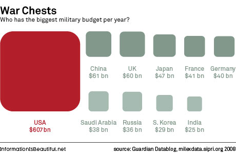
To put this in perspective, the U.S. spends more on defense than the next nine biggest defense spending countries:
But we're a very rich country. How rich? Well, our gross domestic product in 2007 was roughly equal to the GDP of Japan, China, Germany, and Great Britain combined.

Using 2008 figures (the latest I can find), that's no longer quite true, apparently, since China has continued to grow so very strongly. But our GDP is still equal to that of the next three biggest economies, plus more than half of the United Kingdom's.
There are a few more defense spending graphics at that Guardian datablog, too. I don't know about you, but I find this easier to grasp than looking at the raw numbers.


No comments:
Post a Comment